4 minutes
More NBA Stats … but in R no less!: Klay Thompson’s Career PPG
On Thursday, January 8th I was watching the Dallas Mavericks play the Utah Jazz. Early on Klay Thompson seemed a little off. I thought of his time back in Golden State (I was actually in San Francisco in 2015 when the Warriors won the title) and thought about how far we have all fallen (this was a little premature, if I’m honest, as he finished 23, 3, and 5, IIRC). I got it into my head to see what the stats say. I’ve also been working my way towards learning R and thought I might try to produce some graphs of Thompson’s career using that language. So, here we go—it’s not much but, as I say, I’m still in the baby steps phase of learning this language. (Repo is here.)
The script is plenty simple enough—utilizing the “hoopR” package:
# Load packages
library(hoopR)
library(ggplot2)
library(dplyr)
# Get Klay Thompson's player ID
players_list <- nba_commonallplayers(season = "2024-25")
# Extract the actual dataframe
players <- players_list$CommonAllPlayers
# Now filter for Klay
klay_id <- players %>%
filter(DISPLAY_FIRST_LAST == "Klay Thompson") %>%
pull(PERSON_ID)
print(paste("Klay's ID:", klay_id))
# ===== PLOT 1: Annual Averages =====
# Get career stats by season
klay_career <- nba_playercareerstats(player_id = klay_id)
# Extract the season totals dataframe and convert to numeric
klay_seasons <- klay_career$SeasonTotalsRegularSeason %>%
mutate(
PTS = as.numeric(PTS),
GP = as.numeric(GP),
PPG = PTS / GP
)
# Create the annual averages plot
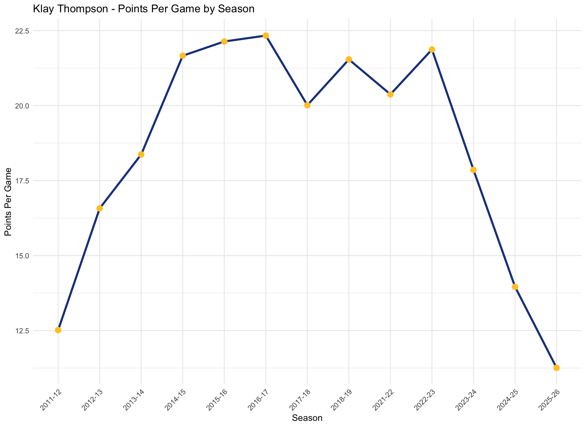
plot1 <- ggplot(klay_seasons, aes(x = SEASON_ID, y = PPG)) +
geom_line(group = 1, color = "#1D428A", linewidth = 1.2) +
geom_point(color = "#FFC72C", size = 3) +
theme_minimal() +
labs(title = "Klay Thompson - Points Per Game by Season",
x = "Season",
y = "Points Per Game") +
theme(axis.text.x = element_text(angle = 45, hjust = 1))
print(plot1)
# Save Plot 1
ggsave("klay_ppg_by_season.png", plot = plot1, width = 10, height = 6, dpi = 300)
# ===== PLOT 2 & 3: Game-by-Game Scatterplots =====
# Get all seasons
seasons_list <- c("2011-12", "2012-13", "2013-14", "2014-15", "2015-16",
"2016-17", "2017-18", "2018-19", "2021-22", "2022-23",
"2023-24", "2024-25")
all_games <- list()
for(s in seasons_list) {
tryCatch({
game_log <- nba_playergamelog(player_id = klay_id, season = s)
# Extract the dataframe from the list
if("PlayerGameLog" %in% names(game_log)) {
all_games[[s]] <- game_log$PlayerGameLog
} else {
all_games[[s]] <- game_log
}
print(paste("Got data for", s))
Sys.sleep(0.5) # Small delay to avoid rate limiting
}, error = function(e) {
print(paste("Error with season", s, ":", e$message))
})
}
# Combine all games
klay_games <- bind_rows(all_games) %>%
mutate(
PTS = as.numeric(PTS),
GAME_DATE = as.Date(GAME_DATE, format = "%b %d, %Y"),
# Check if DAL appears at the START of MATCHUP (meaning Klay is on DAL)
# MATCHUP format is typically "DAL vs. OPP" or "DAL @ OPP" when on Dallas
Team = ifelse(grepl("^DAL", MATCHUP), "Mavericks", "Warriors")
)
# Create scatterplot WITHOUT regression line
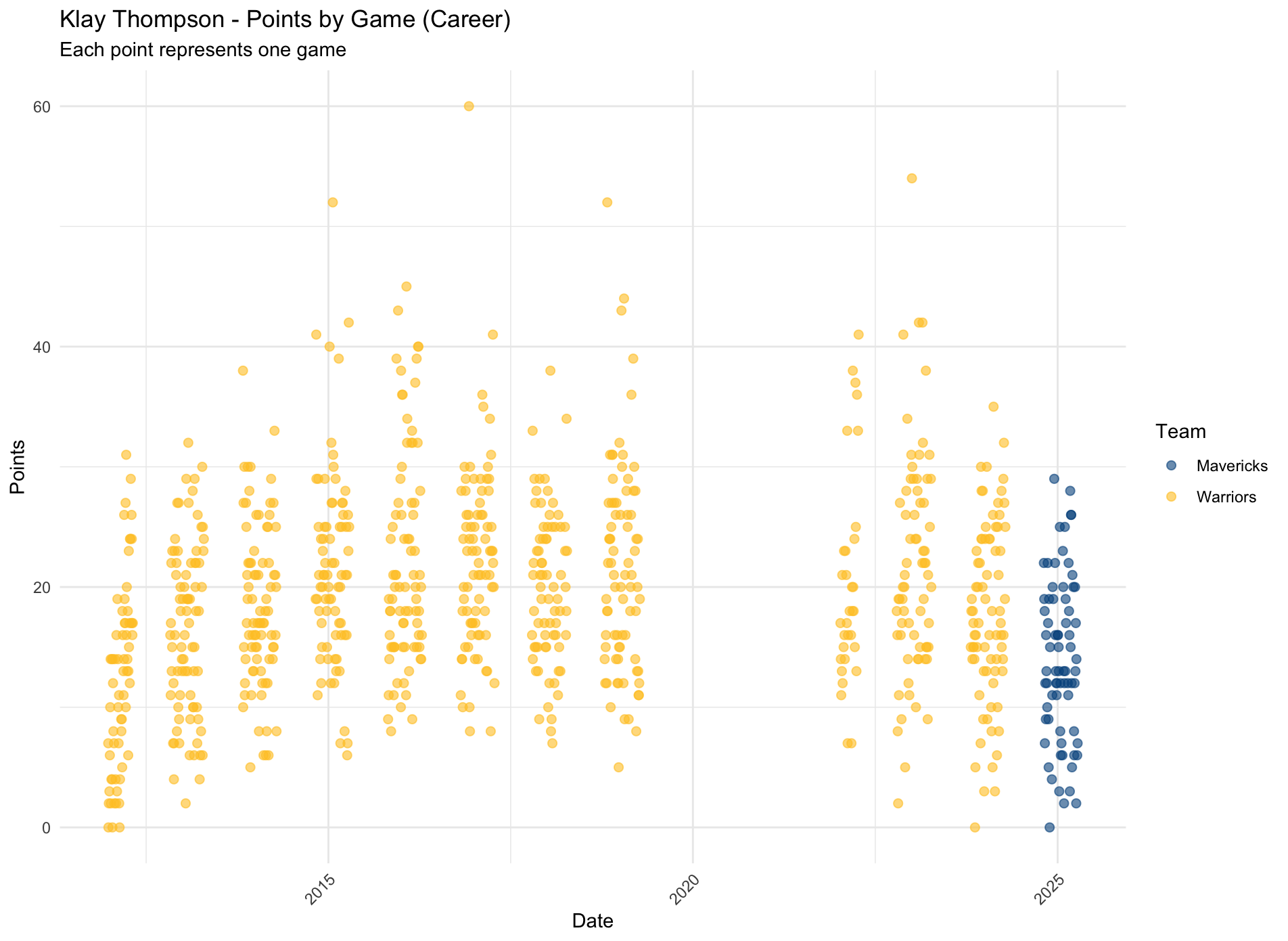
plot2 <- ggplot(klay_games, aes(x = GAME_DATE, y = PTS, color = Team)) +
geom_point(alpha = 0.6, size = 2) +
scale_color_manual(values = c("Warriors" = "#FFC72C", "Mavericks" = "#00538C")) +
theme_minimal() +
labs(title = "Klay Thompson - Points by Game (Career)",
x = "Date",
y = "Points",
subtitle = "Each point represents one game",
color = "Team") +
theme(axis.text.x = element_text(angle = 45, hjust = 1))
print(plot2)
# Save Plot 2
ggsave("klay_points_by_game_no_regression.png", plot = plot2, width = 12, height = 6, dpi = 300)
# Create scatterplot WITH regression line
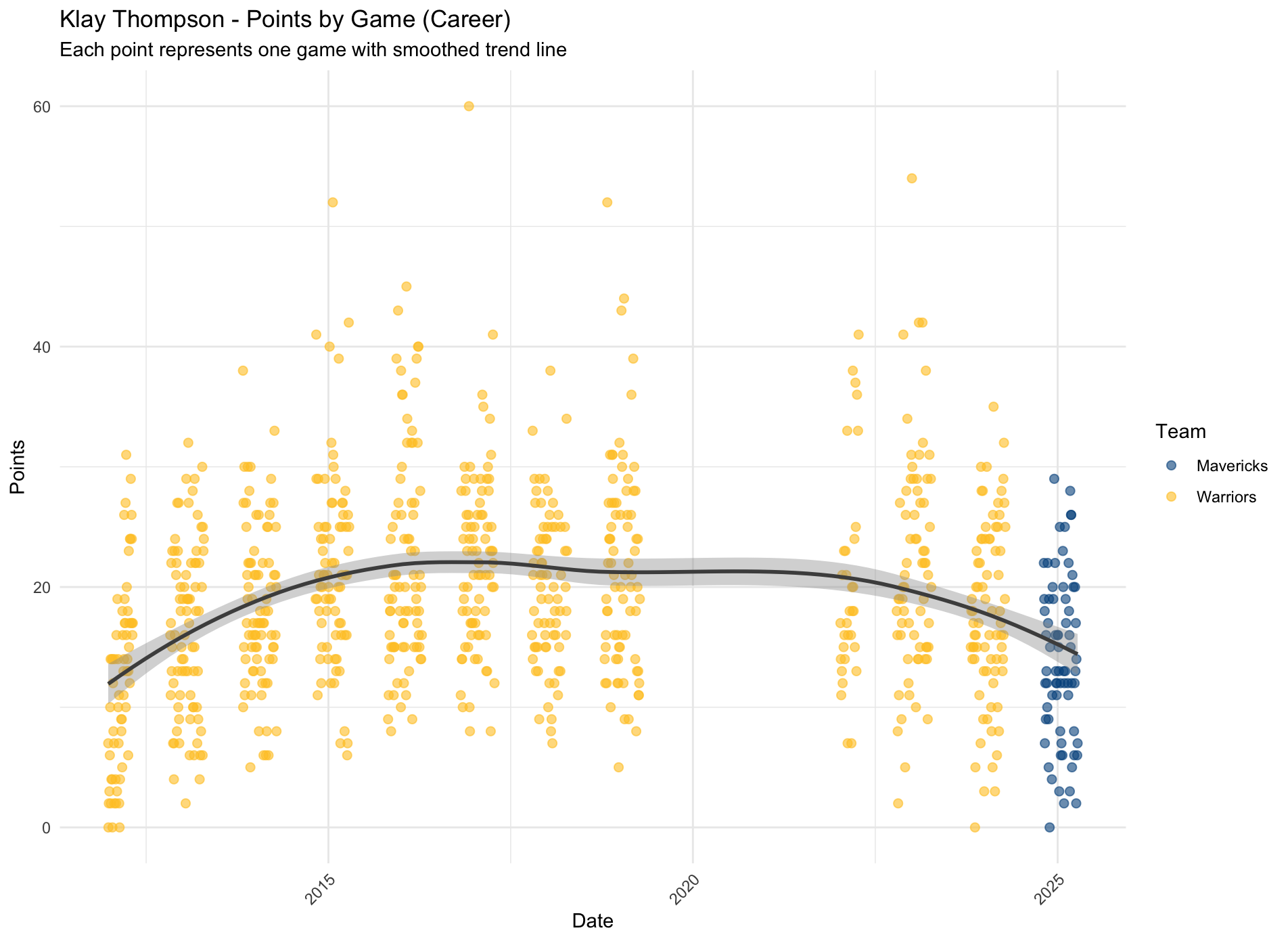
plot3 <- ggplot(klay_games, aes(x = GAME_DATE, y = PTS, color = Team)) +
geom_point(alpha = 0.6, size = 2) +
geom_smooth(aes(group = 1), method = "loess", color = "gray30", se = TRUE) +
scale_color_manual(values = c("Warriors" = "#FFC72C", "Mavericks" = "#00538C")) +
theme_minimal() +
labs(title = "Klay Thompson - Points by Game (Career)",
x = "Date",
y = "Points",
subtitle = "Each point represents one game with smoothed trend line",
color = "Team") +
theme(axis.text.x = element_text(angle = 45, hjust = 1))
print(plot3)
# Save Plot 3
ggsave("klay_points_by_game_with_regression.png", plot = plot3, width = 12, height = 6, dpi = 300)
print("All three plots saved successfully!")
And here are our plots:
P.S. I’m thinking of writing a more general script that will work for any player regardless of the number of teams they have played for—more to come.
R data parsing data extraction data analysis NBA hoopR R for sports ggplot data visualization
685 Words
2026-01-10 00:01