7 minutes
Visualizing Online Class Discussion Boards (redux)
In a very early post on this blog, I went through some of my incredibly kludgy attempts to visualize the discussion boards in my ENGL200: Introduction to Literature: Weird Fiction course that I have been teaching every semester since Fall of 2019. I have improved things quite a bit and made the worfklow a whole lot easier. I figured I could, once again, take everyone through the steps to see if it might be at all helpful for others with similar use-cases. I know that, originally, I had really just wanted to produce some simple “network graphs” that would keep track of the stories and authors that students were referencing in their posts each and every week. In that original post I was hard-coding each time a particular student made reference to a story/author (this quickly just became a simple part of my reading/grading workflow—as I graded and responded to student posts, I would note the authors they referenced in their posts), but I figured it would be nice to see if I couldn’t automate this a little bit.
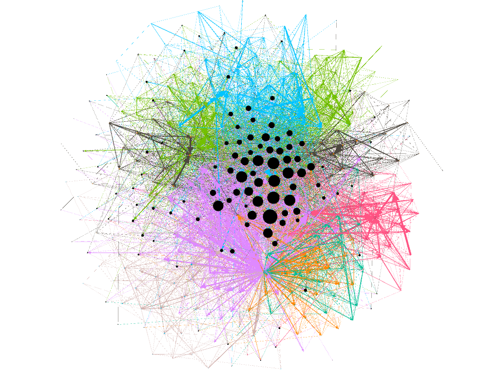
Again, we would love to end-up being able to produce a network graph that looks something like this (produced with Gephi), where all the nodes are the names of the texts and the posters and the edges illustrate when a poster refers to a text or to another’s post:
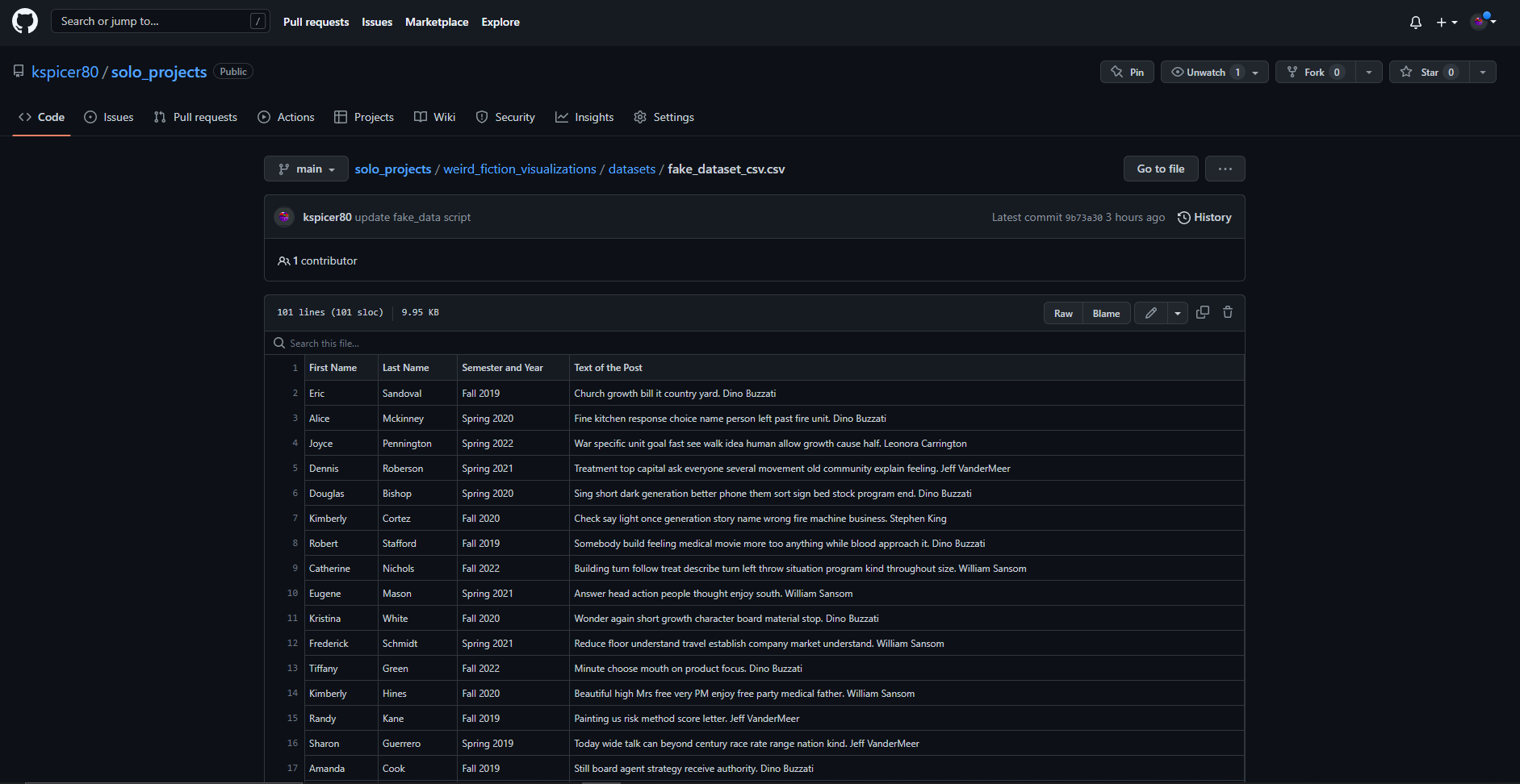
So the first thing we need to do is gather all of the data. Ideally, it would be nice to have some methods native to the Canvas Instructure LMS to download all of the Discussion Board posts from a particular Canvas course shell. At the moment of writing, there is still no way to do this simply using Canvas’s tools, although, again, as seems quite usual and common for Canvas, members of the community have suggested adding such a feature to Instructure’s offerings. Fortunately, there are some user-developed scripts that will allow one to grab all of the posts (the best Canvas Usercript for my purposes is still available through TamperMonkey here). Once you run the script while in the “Discussion Board” assignment area of Canvas, you can get a .csv file that has all kinds of fantastic information and data in it. It will look something like the following (script to generate the fake data below is here):
Of course, the fake one above is already a little bit more cleaned-up than what one gets directly from the Userscript, but I think it’ll work well-enough for our purposes here. As usual, we import our libraries and get our file read in properly:
import pandas as pd
pd.set_option('display.max_rows', 500)
from sklearn.preprocessing import OrdinalEncoder
from pathlib import Path

datafile_path = Path(r'.\datasets\fake_dataset_csv.csv')
df = pd.read_csv(datafile_path)

ord_enc = OrdinalEncoder()
df['entry_id'] = ord_enc.fit_transform(df[['entry_id']]).astype('int')
df['reply_id'] = ord_enc.fit_transform(df[['reply_id']]).astype('int')
Now, in my original workflow, I also had a list of all the student names stored in a dictionary, each keyed to a specific number—for the fake dataset I just ordinally-encoded each of the individual poster names in the entry_id and reply_id columns.
Ideally, what we would like to do is write a function to read through all of the text stirings in the entry_message and reply_message columns and extract out all of the mentions of any authors in our Weird Fiction anthology. I coded a nice long list of all the authors in the anthology along with a list of “aliases” (shorter forms of the names, titles of the stories, etc.) to have our function search for and extract out of mentioned authors within each of the posts (the dictionary is here).
I would like, here, at the outset, to thank Jonathan Reeve (yet again) over at Columbia for helping me think through the logic of this function (he personally corresponded with me via e-mail to assist me in getting this thing to do what I wanted). After importing the dictionary of author names, we define our function:
from author_names import author_Names

def author_extraction(string):
    authorMentions = {}
    for author in author_Names:
        aliases = author_Names[author]
        for alias in aliases:
            if alias in string:
                authorMentions[author] = alias
    return authorMentions
We can now take this and apply it to our dataframe, creating a new column that will keep track of all the extracted author names mentioned in an individual post:
df['extracted'] = df['entry_message'].apply(author_extraction)
df['extracted_from_replies'] = df['reply_message'].apply(author_extraction)
This gives us a new column with all the author mentions that we wanted. The function above returns a python dictionary (dict) object, so it would be nice to “explode” that dictionary and just get a list of the numbers (of the authors mentioned). But before we do that we just quickly reverse all the keys and values of the dictionary to get it how we want it:
def convert_dict(dictionary):
    list_of_keys = list(dictionary.keys())
    return(list_of_keys)

df['target'] = df['extracted'].apply(convert_dict)
Luckily for us (although not too surprising as the pandas library is such a fantastic thing) there’s a function already created for us to do exactly what we want: pandas.DataFrame.explode().
posts_for_explode = df.copy()
df_exploded = posts_for_explode.explode('target')
We’ll do it a little bit more tidying and cleaning-up here:
cols_to_keep = ['topic_title', 'entry_id', 'reply_id', 'Semester and Year']

df_student_to_student = df_exploded[cols_to_keep]
df_exploded_dropped = df_exploded.drop(['entry_message', 'entry_word_count', 'reply_word_count', 'extracted', 'extracted_from_replies', 'reply_message'], axis=1)

frames = [df_student_to_student, df_exploded_dropped]
all_together = pd.concat(frames)
all_together.drop_duplicates()
all_together.dropna(subset=['target'])
If we dump this into a .csv file we’ll have everything together and in the same place and tidied up: all_together.to_csv(r'C:\Users\Kspicer\Desktop\gephi.csv') I really like the Gephi library (which I already mentioned above)—and that program needs a pretty simple structure—it requires a table with a ‘source’ column (that’ll be all the nodes of your graph) along with a ’target’ column, which let’s Gephi know which nodes to draw edges between in the final graph (any other metadata you’d like to put into the table (maybe the week the story was read, the semester in which the post was made, etc.) just goes into another column):
| source | target | week_read | semester |
|---|---|---|---|
| 25 | 45 | 1 | Fall 2019 |
| 1 | 2 | 14 | Spring 2020 |
| 3 | 5 | 6 | Summer 2022 |
| 35 | 56 | 3 | Fall 2022 |
| 26 | 100 | 5 | Fall 2021 |
Once we have everything that we want in the .csv we can then transfer it over to whatever network graphing or data visualization tool is the one of your choice (this format makes it easy to input into NetworkX or Gephi or Tableau or what have you). Gephi was one of the very first digital humanities-esque libraries I got my hands dirty with, so I’ve got a special place in my heart for it in particular. Of course, any of the other visualization libraries can handle this data without any trouble whatsoever (HoloViews and bokeh are great and, to be sure, plotly is also really nice for this as well—all of these libraries interface well with the NetworkX package too, so that can streamline things greatly, there’s even a function in it that will read the list of edges directly from a pandas DataFrame object). In fact, if one would like to see some of the visualizations of all the semesters from my “Weird Fiction” course, there’s a jupyter notebook available here. (A big thanks as well goes over to Melanie Walsh for helping me learn the bokeh visualizations.)
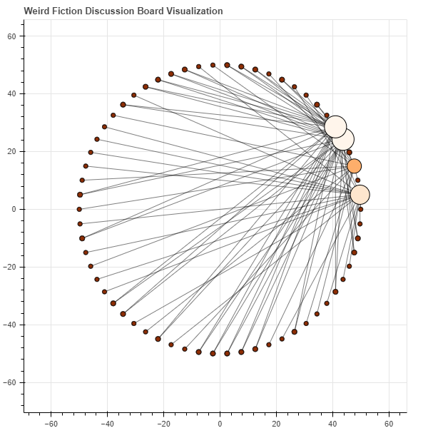
Here’s a nice network graph of the simulated dataset:
In terms of future developments and improvements, it would be nice to see what else we could extract from the TamperMonkey script that downloads all of the discussion board data. I know recently (not sure how recently, to be honest) Canvas started counting the word lengths of all the posts. I can imagine all kinds of interesting questions one could pose to that data: what’s the average number of words for an initial post, for a reply to another student’s post, etc. You could even see if there were trends over time … does the average word count decrease as the semester slogs along and we get tired? Who are the individual students who write and write and write; who are the ones who are more parsimonious in their responses; and so on. As I say, lots of questions could be answered with that information and data. My initial desire was just to make it easier to see which authors in the anthology were the most popular—i.e. which ones did students mention most frequently, were these authors the same ones from semester to semester, year to year, etc. I now have things here where answering questions like these are simple: just pull the data down from Canvas, then feed it into the script, and then plot. Easy-breezy.
discussion boards online learning lms plotly networkx data visualization custom functions automating grading automating student feedback online discussion boards json xml work stuff python python for digital humanities pandas gephi
1415 Words
2022-07-20 00:01