2 minutes
Sentiment Analysis of Some Chicagoland Universities’ Main Twitter Accounts
Well, February has come around and that’s the time at my school where we get all kinds of nice financial data about how wages and compensation by faculty rank compare between a number of “peer institutions” (the usual ones linked with USF here in Chicagoland are Benedictine, Dominican, Lewis, and Saint Xavier) I wondered a bit if one might do a little bit of data visualization not of financial information, but of, say, Twitter accounts. Thinking it might be fun to dabble a little bit in some very basic sentiment analysis, I was curious to see what the main Twitter accounts for these five Chicagoland “peer institution” universities might look like—thus, I wrangled some data (using the snscrape library) to see what there was to see. Would one be correct to assume that Twitter accounts for these universities would slide largely in the “positive” sentiment direction?
Well, let’s start with USF:
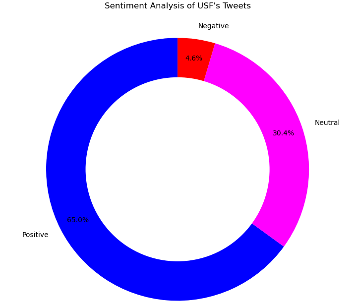
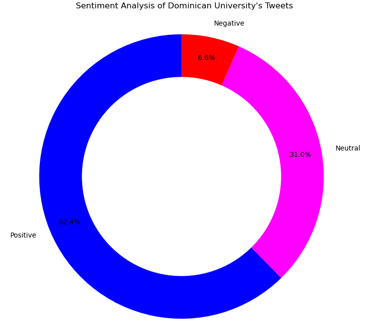
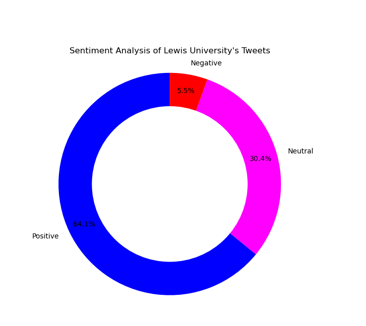
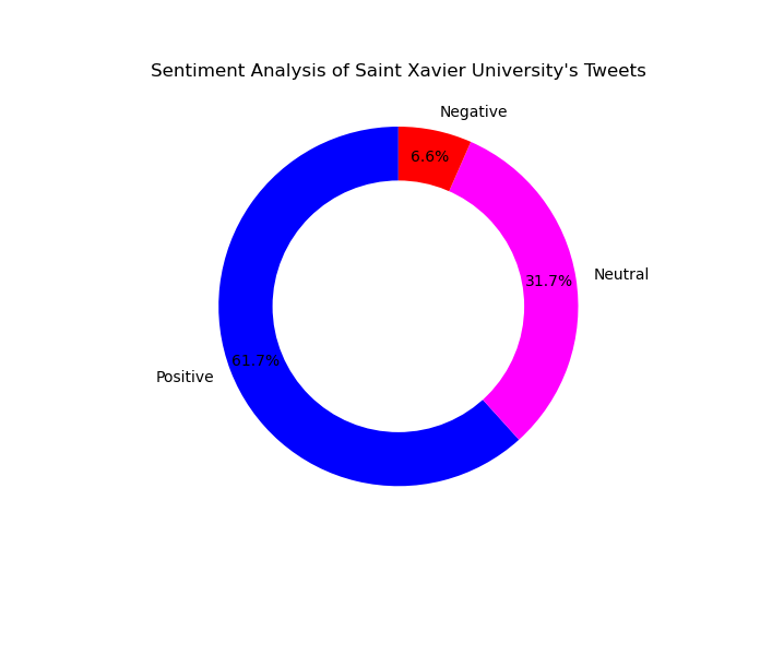
Running all of the university’s tweets through the TextBlob python library, it shows the USF Twitter account to be pretty positive. Results for the rest of the schools is pretty similar:

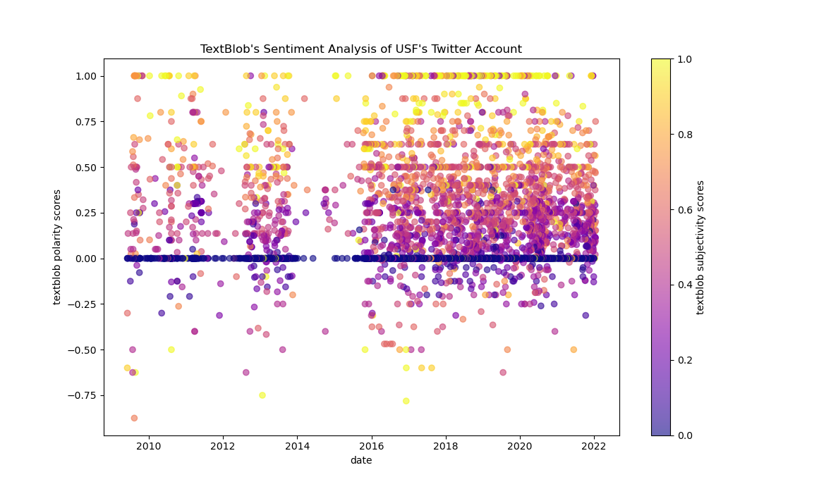
And what about some visuals of sentiment over time? Here’s an image of TextBlob’s analysis of the “polarity” and “subjectivity” scores for each and every USF tweet, ever:
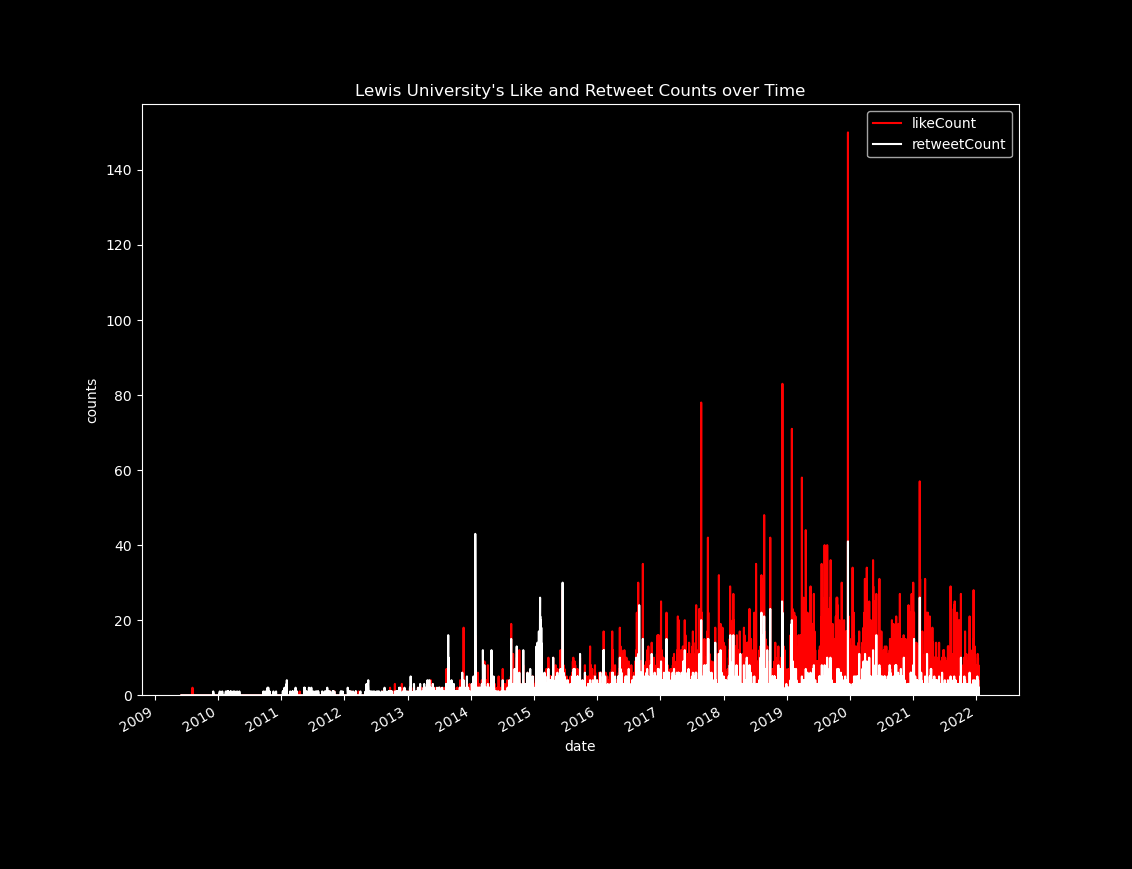
There is quite a bit of data here one could dig into a bit more deeply. What do like and retweet counts look like for some of the school accounts (and how about coding the graphs with the school colors?)—especially over the lifespan of the account? Here’s one for Lewis:
What about using the Bokeh library to add some little “hovertools” that would link each point on the graph to each individual tweet?
Not bad (all thanks to the following post for Hugo shortcode for the Bokeh plot).
As usual, all the data and code for this post are available in this repo.
sentiment analysis TextBlob digital humanities Bokeh Visualization library Python twitter analysis
317 Words
2022-02-14 18:00