6 minutes
Visualizing Online Class Discussion Boards

A Fantastic Anthology
So, this last semester I did another “Introduction to Literature” course (as I so often do)—this time around I decided to set the theme around that of “weird fiction.” Since the South Bend DHRI last May I have been thinking a great deal about this whole “data visualization” thing. I wanted to find some way to visually represent the stories in the anthology that students were gravitating to from week to week. I gave minimal guidance—some weeks I would point out that one of my favorite stories was up on the docket or I tried to link the week’s discussion to concerns or interests that students had shown in previous weeks. (This was just the old “If you liked Julio Cortazar’s “Axolotl,” be sure to read X …”) There had to be an easy way to represent visually all the student interactions.
Not being an expert, I had to stumble around stupidly and idiotically. Starting with something as silly as a Venn Diagram drawn up in Microsoft Word—hoping to keep track of the kinds of connections students were making to the readings:
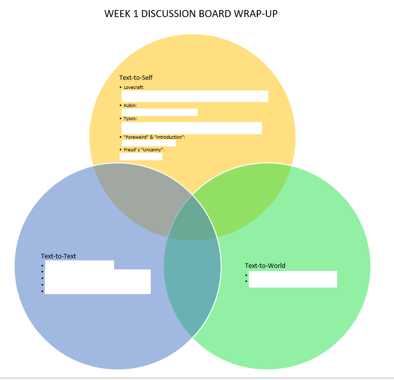
1st Iteration: just trying to draw the discussion board that week (I have whited-out student names)
Of course, I was first just trying to figure out how to simply draw the connections and not worry so much about the how or the kind of connections being made:
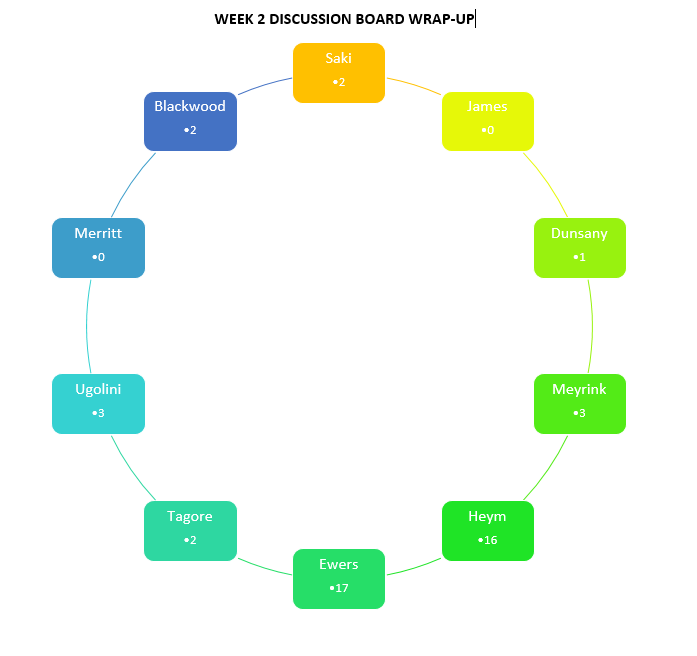
2nd Iteration: now simply logging the number of posts about each particular story
Heck—I could draw it by hand, but I wanted to be able to do it not just each week but also be able to produce a graph that would visualize the entire sixteen-week seminar.
And then I came across a tool (IIRC, I found a couple of tutorials on YouTube by jengolbeck), a tool called Gephi that would allow me to do exactly what I wanted—and quite a bit more, actually. I could take all of the students, myself, and all the texts that we would read, get them into a simple .csv file and then each week I could manually code the connections each individual student was making to the possible texts up for discussion (and also log the times students responded to me or to each other).
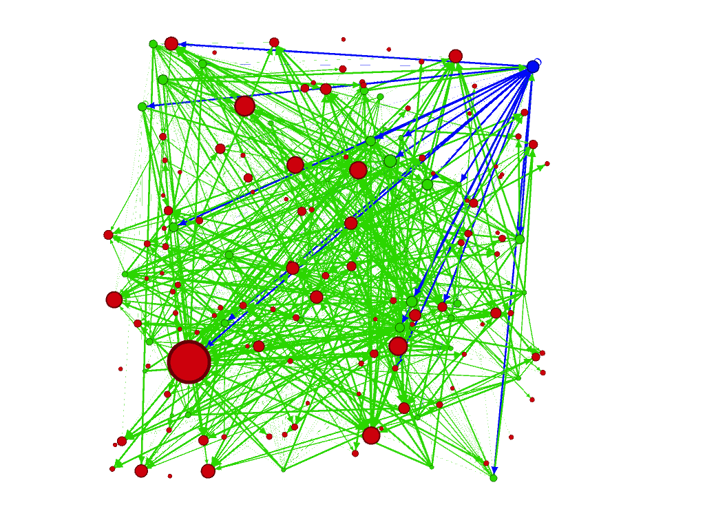
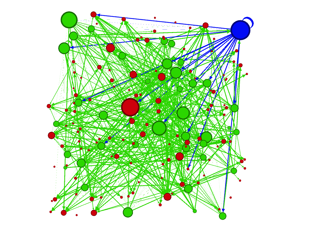
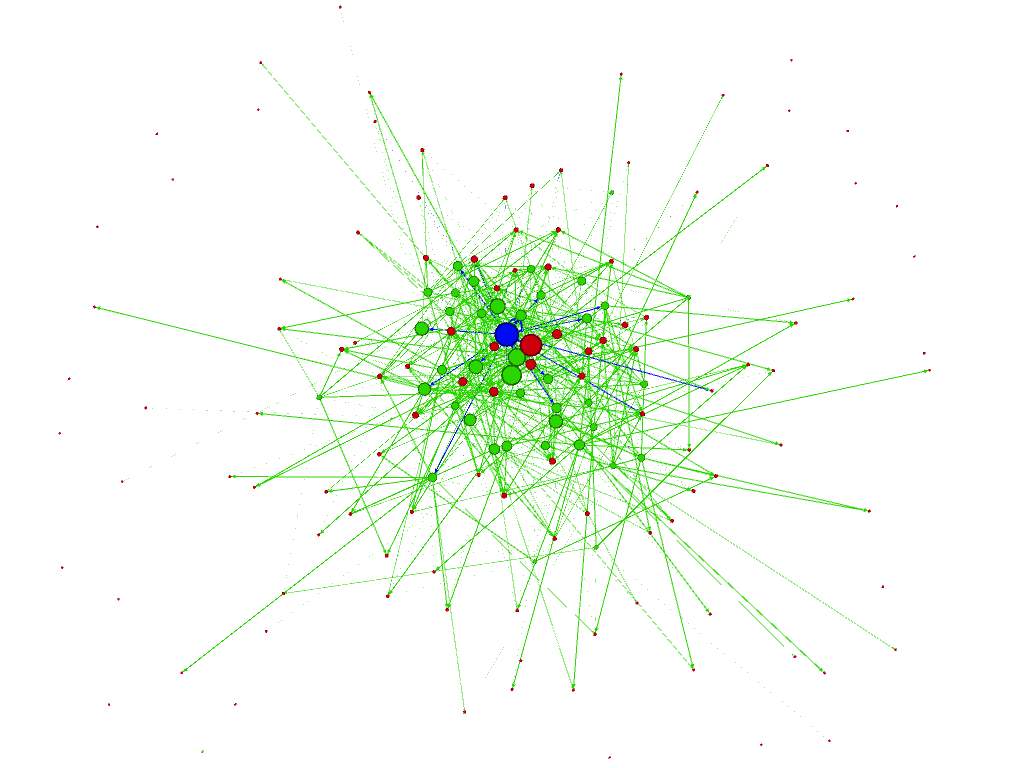
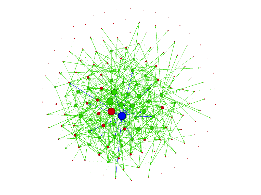
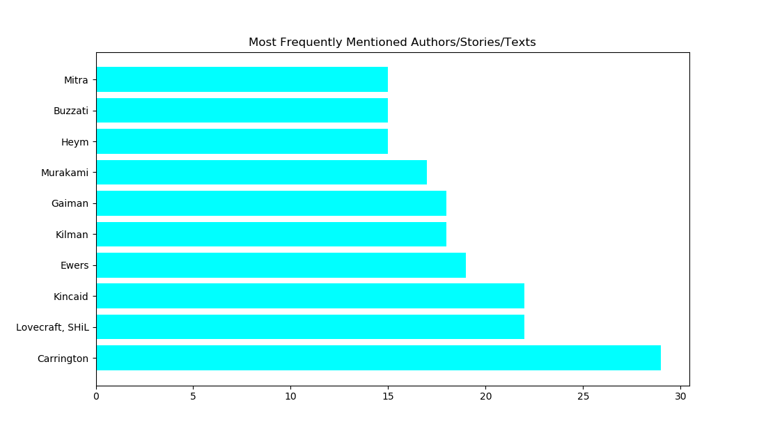
These are just some of the visualizations I played with over the course of the semester (all the green dots are students, the blue dot is me, and all the red ones are stories we read and that students discussed; the size of the nodes are determined by the “degree” of the node). The big red node in the graph in the upper left was the most talked about story out of the entire anthology, Leonora Carrington’s 1941 absurdist little tale, “White Rabbits.”
The tool also gives one some rather basic graph theory and simple statistical information as well. It is easy to have the computer count up the connections, making it rather simple to figure out the most popular texts over the course of the seminar:
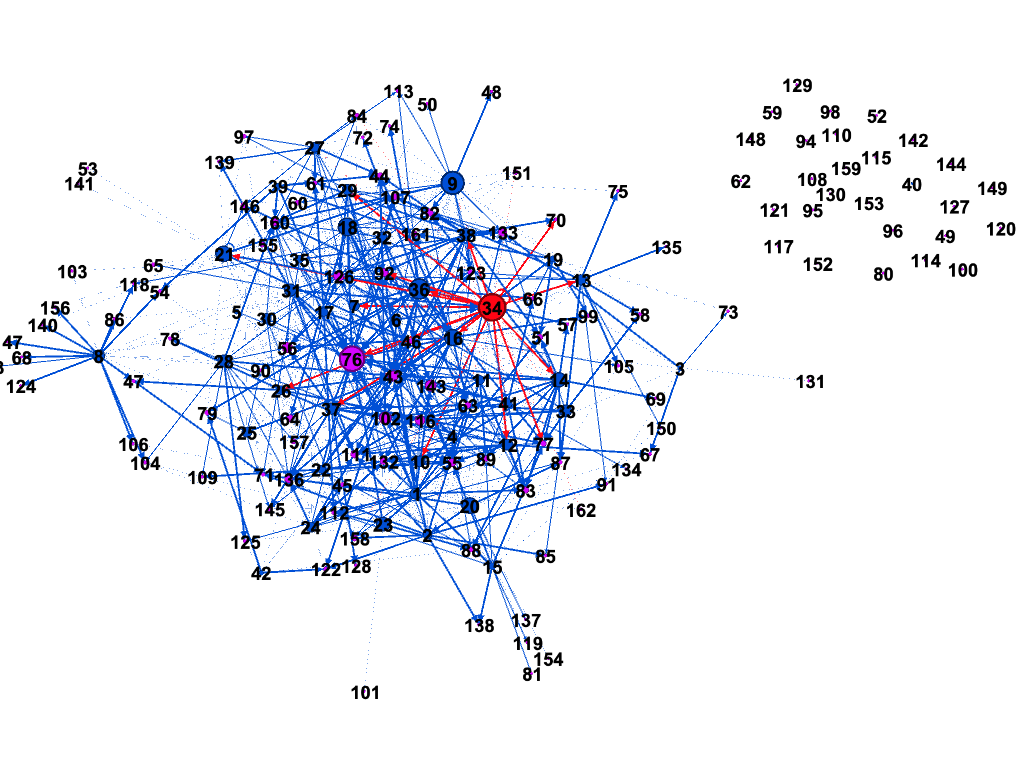
It was also really simple to see which stories students did not talk about at all (the group in the upper right are all the texts no one mentioned):
Obviously, there are all kinds of ways to make this data slightly “richer.” After a week or two I noticed that I did want to get back to the “kinds” of connections students were making to the texts. Thus, Gephi makes it easy to “weight” the connections, so I started cataloging how students were interacting: if they cited lines directly from the story, the line was weighted as a 2; if they were strongly referring to the story only through paraphrase, it got a 1.5; no citation whatsoever got a 1. This would then make it easier for me to see how often students were doing something as basic as directly citing the story under discussion in their posts.
It would be cool—I’m not sure at all if there is a way to do this from within Gephi—if one could time lapse this whole thing so one could watch the connections get drawn over the course of the semester. One can—and I did—keep track of which connections got made each week (that’s as simple as adding another column in the .csv): I had originally wanted to see if I could track the size of my own node over time: my plan was to be a really frequent participant in the first few weeks of the semester. It’s easy to show in the graph how those first few weeks of the semester saw me responding to every single student post. I had hoped that my node would become slightly smaller and smaller as the semester went on. By and large, that was true.
I have no doubt that I will continue to fiddle around with all over this the next time I teach this course (which will be in the Spring here after the start of the new year). What kinds of things will I see popping up when I do all this a second time? Will I see a similarity in terms of popularity of texts over the semester? Will I see that similar phenomenon where we have a somewhat small(ish) group of students who are really “talkative” as we usually do in our f2f classrooms (while the larger group is slightly more reserved)? I have no clue—I’m curious to see. (I spent a little bit of time, not much, dabbling with tools/libraries in Python that would do something similar—I know there is iGraph and there no doubt have to be others that I don’t even know about. Another slightly more “technical” rather than philosophical question would be whether or not I would want to figure out a way to automate all of this rather than coding it by hand, so to speak. I know that spaCy has some really powerful tools that one could use to do this: create a custom NER [Named Entity Recognition] with the names of the texts, students, etc., write a script to have the computer find which students are looking at which stories, and then to have it draw the network graph. It would also be somewhat simple enough to think of a way to script the whole process that would also allow you to set some criterion for the whole “weighting” of the edges, too, though that would need to be a little bit more sophisticated.)
More to come, as always …